Mathematics for IGCSE & O level - Statistical Diagrams (Section 4)
1
Which of the following values needs to be calculated to draw a histogram?
2
What does a horizontal line segment on a cumulative frequency diagram indicate?
Answer(A)
No data values in that range.
3
Which of the following is NOT a measure of spread?
4
In a cumulative frequency diagram, what is the relationship between the median and the total frequency?
Answer(B)
The median is the value at 50% of the total frequency.
5
Which of the following is a measure of central tendency?
6
What type of data is best represented using a histogram?
7
If the upper quartile is 75 and the lower quartile is 25, what is the interquartile range?
8
What information does the 75th percentile represent?
Answer(C)
The value below which 75% of the data falls.
9
What is the purpose of class intervals in a frequency table?
Answer(B)
To organize data into groups for easier analysis.
10
In a cumulative frequency diagram, how is the lower quartile determined?
Answer(A)
Find the value on the x-axis corresponding to 25% of the total frequency.
11
What is the primary goal of a statistical diagram?
Answer(B)
To represent data visually for easy understanding.
12
Which of the following is a measure of central tendency?
13
In a histogram, what does the area of each bar represent?
14
In the histogram of the student's travel time, what is the approximate frequency density of the 15-25 minute group?
15
If the lower quartile is 10 and the upper quartile is 30, what is the interquartile range?
16
What is the 10th percentile?
Answer(B)
A value where 10% of the data is below
17
What does a steep gradient in a cumulative frequency graph indicate?
Answer(A)
A high frequency of data within that interval.
18
What is the most appropriate graphical representation for displaying the relationship between two variables?
19
How is the interquartile range (IQR) calculated?
20
Which of the following graphs can show the number of passengers?
21
What is the range of a data set?
Answer(C)
The difference between the maximum and minimum values.
22
What does the area of a bar in a histogram represent?
23
What type of data is typically displayed using a histogram?
24
When are the mean and median equal?
Answer(C)
When the data is normally distributed.
25
Which statement is TRUE about the cumulative frequency curve?
Answer(A)
The curve always increases.
26
What can a pie chart be used to effectively show?
Answer(B)
The distribution of a whole into parts
27
What is the relationship between the class width, frequency, and frequency density in a histogram?
Answer(D)
Frequency Density = Frequency / Class Width
28
What is a 'class interval' in the context of a histogram?
Answer(B)
The range of values grouped together in a histogram.
29
Which of the following is a characteristic of a strong positive correlation in a scatter diagram?
Answer(C)
The points form a clear upward trend and are close to the line of best fit.
30
Which phrase best describes the relationship shown by a scatter diagram where the points show a weak positive correlation?
Answer(A)
As one quantity increases, the other quantity increases slightly.
31
Which of the following properties of a histogram are true?
32
Which of these diagrams will NOT show the correlation between two variables?
Answer(B)
A cumulative frequency diagram.
33
What does the term 'frequency density' signify in a histogram?
Answer(A)
The frequency per unit of class width.
34
Which of the following is best used to determine the most frequently occurring data value?
35
What does the term 'class width' refer to in a histogram?
Answer(A)
The range of values in each interval.
36
What does a negative correlation on a scatter diagram indicate about the relationship between the two variables?
Answer(B)
As one variable increases, the other decreases.
37
Which of the following statements is true regarding the median?
38
If the class intervals in a histogram have different widths, what is plotted on the vertical (y) axis?
39
What is the primary use of a scatter plot?
Answer(B)
To show the relationship between two variables.
40
What information does the area under a histogram bar represent?
41
What is the term for a value that divides a dataset into two equal halves?
42
What is a key advantage of using the interquartile range?
Answer(B)
It is less susceptible to the impact of outliers.
43
Which of the following can be determined from a cumulative frequency diagram?
44
Which of the following scatter diagrams shows a strong positive correlation?
Answer(B)
A graph showing a positive slope with points close to the line.
45
Which of the following statistical measures is least useful when describing skewed data?
46
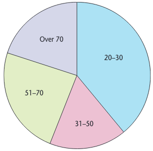
In the pie chart, the sectors represent the age groups. If the sector size is proportional to the frequency, which age group has the largest size?
47
If a dataset has a range of 50 and an interquartile range of 20, what does this indicate?
Answer(A)
The data is very spread out.
48
Which of the following is used to represent continuous data?
49
Which is the best way to describe the shape of a positive correlation?
Answer(B)
From bottom left to top right
50
Which of these is a measure of dispersion?