Mathematics for IGCSE & O level - Statistical Diagrams (Section 2)
1
Based on the key points regarding cumulative frequency diagrams, what is true?
Απάντηση
A
B
D
2
What type of data is suitable for displaying on a histogram?
Απάντηση
(C)
Continuous data
3
What does the area under each bar in a histogram represent?
Απάντηση
(B)
Frequency
4
In a cumulative frequency diagram, the value on the x-axis that corresponds to 50% on the y-axis is:
Απάντηση
(B)
The median
5
How is the median value of data found from a cumulative frequency diagram?
Απάντηση
(B)
Look up the value at 50% cumulative frequency.
6
What are the benefits of using cumulative frequency diagrams?
Απάντηση
A
B
D
7
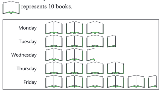
The pictogram below depicts the number of books borrowed, how many books were borrowed on Wednesday?
Απάντηση
(B)
25
8
If a cumulative frequency graph is flat, what does this indicate?
Απάντηση
(B)
A zero frequency.
9
How does the frequency density relate to the class width and frequency in a histogram?
Απάντηση
(A)
Frequency Density = Frequency / Class Width
10
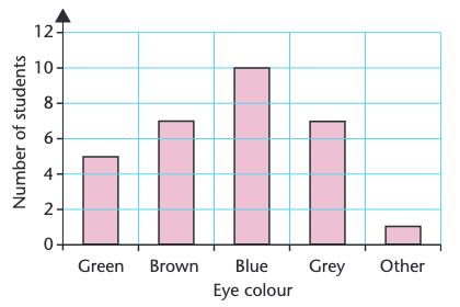
What is the most common eye color based on the bar chart?
Απάντηση
(B)
Blue
11
What is the purpose of the horizontal axis on a histogram?
Απάντηση
(A)
To display the class intervals
12
In the context of the histogram, what does the area of each bar represent?
Απάντηση
(A)
Frequency
13
What does a negatively skewed histogram look like?
Απάντηση
(A)
The tail is on the left side.
14
In a histogram, which axis is used to plot the frequency density?
Απάντηση
(B)
Vertical axis
15
How is the lower quartile estimated using a cumulative frequency diagram?
Απάντηση
(A)
The value on the x-axis corresponding to the 25th percentile.
16
How do you calculate the frequency density of a particular class interval?
Απάντηση
(B)
Frequency / Class Width
17
What is the advantage of using a pictogram over a bar chart?
Απάντηση
(C)
Pictograms are easier to understand for people.
18
In the context of a cumulative frequency graph, what does a steep slope indicate?
Απάντηση
(B)
High frequencies
19
What does a symmetrical histogram suggest?
Απάντηση
(C)
A normal distribution
20
Which of the following is a characteristic of a cumulative frequency diagram?
Απάντηση
(A)
The y-axis always starts at zero.
21
What is the formula for calculating frequency density?
Απάντηση
(A)
Frequency Density = Frequency / Class Width
22
What does a histogram represent?
Απάντηση
(D)
The distribution of continuous data
23
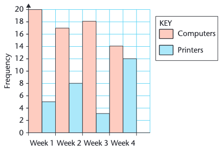
What is the total number of computers and printers sold in Week 3?
Απάντηση
(B)
25
24
What is the primary difference between a bar chart and a histogram?
Απάντηση
(A)
Histograms display continuous data, while bar charts show categorical data.
25
Based on the bar chart, which eye color has the second most students?
Απάντηση
(C)
Grey
26
If the frequency is 14 and the class width is 10, what is the frequency density?
Απάντηση
(B)
1.4
27
What can be found from a cumulative frequency diagram?
Απάντηση
A
C
D
28
When is it particularly important to use frequency density rather than simply frequency in a histogram?
Απάντηση
(C)
When the class intervals have unequal widths.
29
If the class widths in a histogram are unequal, what must be considered when interpreting the diagram?
Απάντηση
(B)
The frequency density of each class
30
How can you find the number of data points within a specific range using a cumulative frequency diagram?
Απάντηση
(A)
Subtract the cumulative frequencies at the start and end of the range.
31
Based on the key points, which of the following statements are true regarding a line of best fit?
Απάντηση
A
B
C
32
What is the significance of the area of each bar in a histogram?
Απάντηση
(A)
It represents the frequency of that class.
33
Which of the following statements is accurate regarding correlation?
Απάντηση
(D)
A scatter diagram can be used to identify a relationship (correlation) between two sets of data.
34
In a positively skewed distribution, what is the general position of the mode relative to the median?
Απάντηση
(B)
The mode is less than the median.
35
Which of the following diagrams is most suitable for displaying continuous data?
Απάντηση
(C)
Histogram
36
In the context of cumulative frequency diagrams, what does the 75th percentile represent?
Απάντηση
(C)
The upper quartile
37
What must be calculated first to draw a histogram?
Απάντηση
(C)
Frequency density
38
Based on the bar chart, in which week was the difference between computer and printer sales the greatest?
Απάντηση
(B)
Week 2
39
How can the median be found using the cumulative frequency diagram?
Απάντηση
(C)
By finding the x-axis value corresponding to the 50th percentile.
40
What is calculated as 'frequency / class width'?
Απάντηση
(B)
Frequency density
41
In which week were the most printers sold?
Απάντηση
(B)
Week 2
42
What should be plotted on the y-axis in a histogram?
Απάντηση
(B)
Frequency Density
43
What kind of correlation is present when the data points on a scatter diagram are scattered and do not show a clear trend?
Απάντηση
(C)
No Correlation
44
Which of the following statements accurately describes a positively skewed distribution?
Απάντηση
(D)
The mean is greater than the median.
45
What does the shape of a cumulative frequency graph indicate?
Απάντηση
(A)
The distribution of data
46
What type of graph is the best suited for showing the distribution of data?
Απάντηση
(C)
Histogram
47
What information can be gained from a histogram?
Απάντηση
A
B
D
48
What type of data is typically represented using a cumulative frequency diagram?
Απάντηση
(C)
Continuous data
49
Which type of correlation is shown in the scatter diagram where the points are closely clustered in a line, as one quantity increases, so does the other?
Απάντηση
(A)
Strong positive correlation
50
How many books do the symbol in the pictogram represent?